Changing the design of the questionnaire
You can customise the design of the questionnaire so that is is similar to your website design. All questionnaires created within your tenant will have the same design so that you do not have to change the design if you create a new questionnaire within the tenant.
1. To change the design, navigate to the Design tab in the top navigation.

2. This section is defaulted to show the My Theme subsection where you can see the current design of the questionnaire. To change the design and make a new theme, click the Customize tab.

3. You can name your theme by clicking on the edit icon on the Title field.
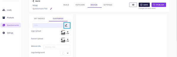
4. Underneath this you will see the Logo Upload field. You can upload your company logo by clicking on the upload icon or the image box.

5. An Upload Images popup window will show. You can either drag and drop the image file or by clicking the Upload from Computer button and selecting the correct file from your device.

6. Once the image is selected, click Add to Page at the bottom of the popup window. This will close the popup and you will be able to see the logo appear in the image box next to the field.

7. Next you can upload your company favicon by clicking on the Favicon Upload image box or icon. The process is the exact same as uploading a logo and once added you will be able to see the favicon appear in the image box next to the field.

8. If you want leads to be able to click the logo that you uploaded and be redirected to your website, enter the URL in the Website URL field.

9. Next, you will see 10 different fields with a colour field next to each. By clicking into the colour picker field, you will see a colour picker chart where you can pick the colour of a certain text, button or background.


10. There is also a field where you can enter in the HEX value of the colour so that you can easily select the exact colours used on your website. You can also click the up/down arrow button at the side of the HEX value field to switch between HEX, RGBA and HSLA fields.

11. The Logo Background corresponds to the background colour of the logo. This is shown at the very top of the questionnaire as a header.


12. The Background refers to the background color of the main section of the questionnaire where the question and answers are shown.


13. The Library Icon field refers to the colour of any Pipelyne Library Icons that have been added to the picture choice questions. This field will only change colour of any icons that you add in from the Pipelyne Library and will not change the colour of any icons or images that you have added in.


14. The Question field refers to the colour of the question text.


15. The Body field refers to the colour of the answer text.


16. The Product field refers to the colour of the product text.


17. The Button field refers to the colour of the all the buttons shown throughout the questionnaire and in the outcomes.


18. The Button Text field refers to the colour of the button text.


19. The Recommended field refers to the colour of the recommended label shown on products that are added to the recommended section of the outcomes.


20. The Recommended Text field refers to the colour of the recommended label text.

